Welcome to the Piano World Piano Forums Over 3 million posts about pianos, digital pianos, and all types of keyboard instruments. Over 100,000 members from around the world.
Join the World's Largest Community of Piano Lovers
(it's free)
It's Fun to Play the Piano ... Please Pass It On!
Yep - can run on 8 AA batteries... I've been waiting for years (decades) for a pro board (88 weighted keys) that's light weight (24 lbs) that can run on batteries!!!! Couple that puppy with a Roland KC-110 stereo keyboard amp (also runs on batteries) and you can play ANYWHERE!!! Great for outdoor parties. Thank you Casio, and thank you Mike Martin!! BTW: finally got to meet Mike in person at NAMM... great guy!
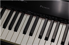
@Mike Martin ; if the PX5S is not in production yet, would it be possible at all to do something about the design esthetics before it runs of the production line ? Even if it was only making it all black that would already do a lo of good IMHO. My impression is that almost everyone is impressed by the keybed, sound and things the px can do, but hardly anyone praises how it looks. It's probably too late, but I'd thought I'd mention it anyway. Perhaps a better looking PX5 BK is already planned or some design (color?) tweaks have indeed been implemented before the production started, I don't know...
Ps was it a prototype at Namm ? That would perhaps explain why it looked so "patched and stitched together" on the YouTube reviews.
Don't get me wrong - I'm quite impressed by the PX5 (I was already pleasantly surprised by the normal PX series and the PX5 has filled in many request that remained, like good EP's) . It's just it's appearance that spoils it in my opinion - but perhaps it doesn't matter and it will sell anyway...
Even if it was only making it all black that would already do a lo of good IMHO.
Anything but all black! One of the worst things about the PX3 (and even worse on the black PX330) was that it was very difficult to quickly and reliably operate their black-on-black panels on a stage (or any environment without optimum lighting). The new design is a welcome functional improvement there.
Mike, can you do a test for me on the PX5s? The fast repetition test... And post it as a video for us?
"But its got a crap keyboard action Dave ... no amount of great sounds help that." Dr. Popper
Majoring in Piano at University of São Paulo - Ribeirão Preto Music Education Major at Music Department of FFCLRP - University of São Paulo P-515, P140 and DGX-670 Previously: Rönisch Upright, MOX8.
Don't mean to jump on stylistic bandwagons but I'm gonna'. I owned the PX3 and the black on black look was extremely difficult to read(sorry JFP) in many environments. The new look is an improvement. Just my opinion:) Of course I haven't seen it in person. I have a question for those who have played it. Does the chassis seem firmer than the 350?.
Quote: "I owned the PX3 and the black on black look was extremely difficult to read(sorry JFP) in many environments. "
OK, point taken; perhaps not all black then, but at least 'something' to get rid of the toy-like / plastic look it now seems to have. There must be more classy color combinations, that are still readable in different circumstances, can't believe that this was the only possible design for Casio to come up with.
From the stage angle (backside) it looks decent enough.
From a working angle I cannot really tell because that particular blue hue on white does not read accurately in photographs. It would be good if they added a light to the on/off button. The panel text and buttons are similar to those on the PX350 and I reach for the closest lit button instead of the unlit on/off button all of the time.
Located an image that can be enlarged quite a bit:
(Click to enlarge)
I don't think the color scheme looks any worse than the Yamaha MO or the Motif XS:
From the stage angle (backside) it looks decent enough.
Nah its a shocker from there as well .....
Quote
I don't think the color scheme looks any worse than the Yamaha MO or the Motif XS:
Yeah but they are just plain and boring ...not hideously and offensively ugly like the PX-5S ... but don't just go on the pictures and videos because in the flesh it looks even worse.
"I'm still an idiot and I'm still in love" - Blue Sofa - The Plugz 1981 (Tito Larriva) Disclosure : I am professionally associated with Arturia but my sentiments are my own only.
Even if it was only making it all black that would already do a lo of good IMHO.
Anything but all black! One of the worst things about the PX3 (and even worse on the black PX330) was that it was very difficult to quickly and reliably operate their black-on-black panels on a stage (or any environment without optimum lighting). The new design is a welcome functional improvement there.
Function over form!
Casio seems to get "hands-on market research", "function over form" and "value for money". Perhaps they should make the PX5S even uglier to make sure it stands out and to bring the point home.... For example, thrifty retail stores such as ALDI have even found that their sales go down the nicer they make their stores look. A good looking store with labour-intensively mirrored shelves just doesn't match the idea of cheap. For many purchase decisions, the perception of a "good deal" unconsciously relies on picking up on cues that indicate that less money was obviously "wasted" on aesthetics or superficial, in-the-way of usability design.
At under 750 euros "self import" price, this board would seem to be destined to become the must have, good value, it does what you want it to do, ugly little keyboard you can't resist buying.
In the meantime many firms have grown really big with form over function marketing, whilst others who purely stuck to the function no-nonsens approach have faltered. Design IS an important part of the product as a whole these days - at least it will help boost sales a little more.
I agree that in basis the feature set and functional implementation of these features should be done well. But then the finishing step should still be design (actually it should be part of the whole product development process - you can't disconnect these two concepts).
Casio doesn't seem to care and due to the low price they will indeed sell anyway; but would it do any harm to have someone with a good eye and sense for classy design details have a say in the product development at Casio ? I doubt it would make these products much more expensive.
I doubt it would make these products much more expensive.
Maybe next year...
With this one I actually think it cost them MORE money to make it ugly then it would have to make it nice .... It's almost like they deliberately tried to make it as cheap and nasty looking as they could or ... Whoever designed it had absolutely no taste and neither did their guide dog.
"I'm still an idiot and I'm still in love" - Blue Sofa - The Plugz 1981 (Tito Larriva) Disclosure : I am professionally associated with Arturia but my sentiments are my own only.
My only complaint is that it would be nice if they silk screened the raised lettering on the back connector labels in a contrasting color. I don't read Braille.
A long long time ago, I can still remember How that music used to make me smile....
My only complaint is that it would be nice if they silk screened the raised lettering on the back connector labels in a contrasting color. I don't read Braille.
Yeah... the jacks are labeled on top, but if the board is on the bottom of a two-tier stack, and you're trying to wire it up from the back in less than ideal lighting, forget it.
But the funny thing is, from looking at the sonicstate video, the Audio In jack is nicely labeled on the back! That makes it even more odd that the other jacks aren't similarly labeled.


![[Linked Image]](http://farm9.staticflickr.com/8365/8412164583_d2158dbf51_c.jpg)
![[Linked Image]](http://www.houseofjapan.com/images/2013/01/casioPriviaPROPX5S.jpg)
![[Linked Image]](http://data.yamaha.jp/sdb/product/image/main/raw/m/mo8/3A10972C64DC4D90AD5D46964D558631_12073.jpg)
![[Linked Image]](http://data.yamaha.jp/sdb/product/image/main/raw/m/motif_xs8/8360A55E54C843B28328FC69FCF84A9B_12073.jpg)